YouNow – Broadcast Analytics
The Project
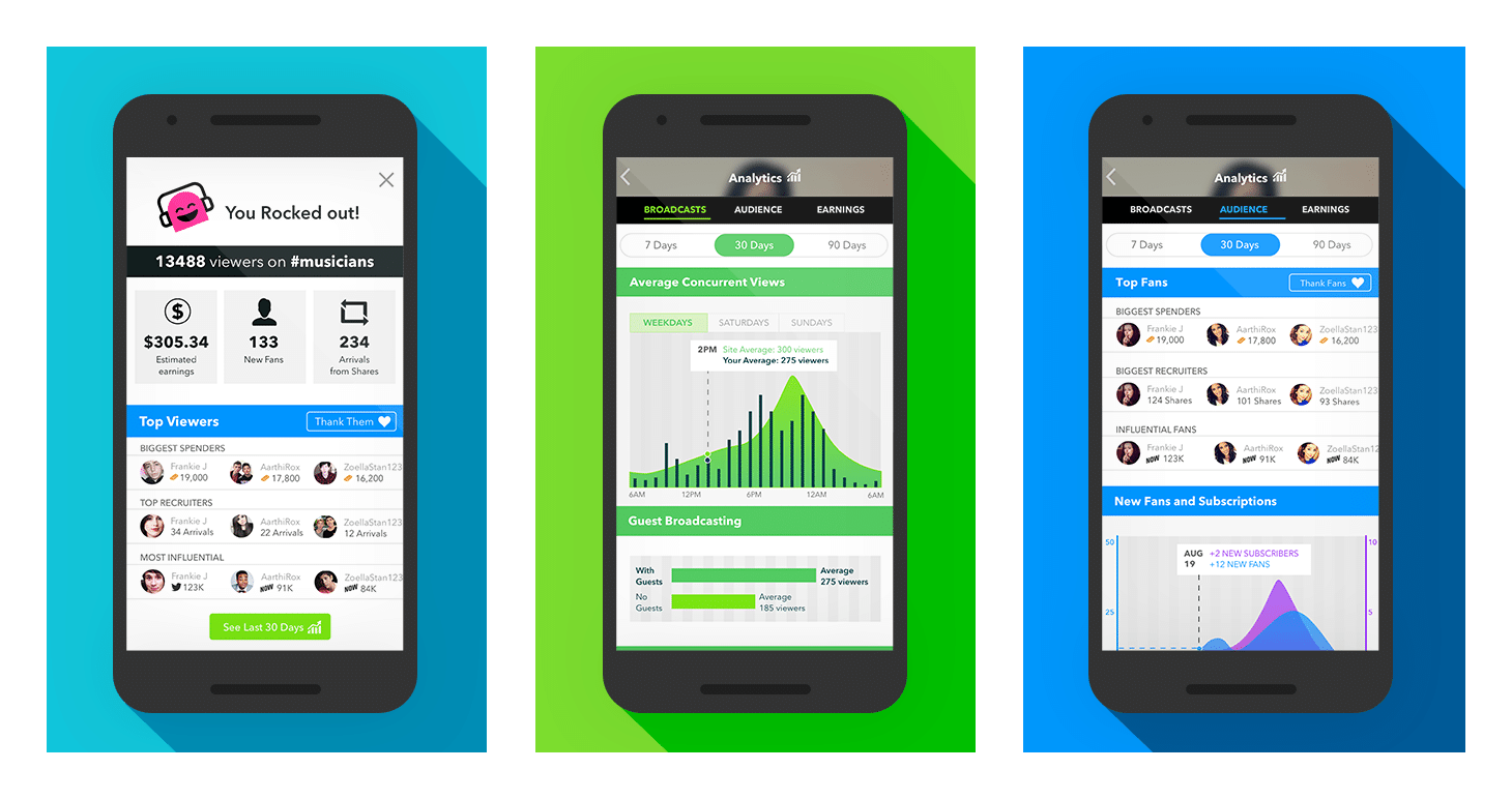
Broadcast Analytics is a set of features designed to provide performance insights for broadcasting partners on the YouNow platform. YouNow is an interactive live-streaming app, which allows broadcast partners to earn revenue, by receiving virtual gifts and subscriptions from fans.
Prior to the project, information about earnings, engagement with audience and performance on the platform was minimal and difficult for broadcasters to assess. I set out to improve visibility around broadcast performance, as well as provide simple and actionable insights that our broadcasters wanted to know.
My Role
- Worked with product and partner managers to define the scope and project objectives.
- Conducted users interviews to understand the needs, behaviours and motivations of broadcast partners.
- Ran remote card-sorting exercise to define and prioritize broadcast insight features.
- Sketched multiple concepts, designed and tested clickable prototypes for the mobile and desktop apps.
- Worked within an agile team to launch MVP for the desktop.
Research & Exploration
Defining Objectives & Sketching Concepts
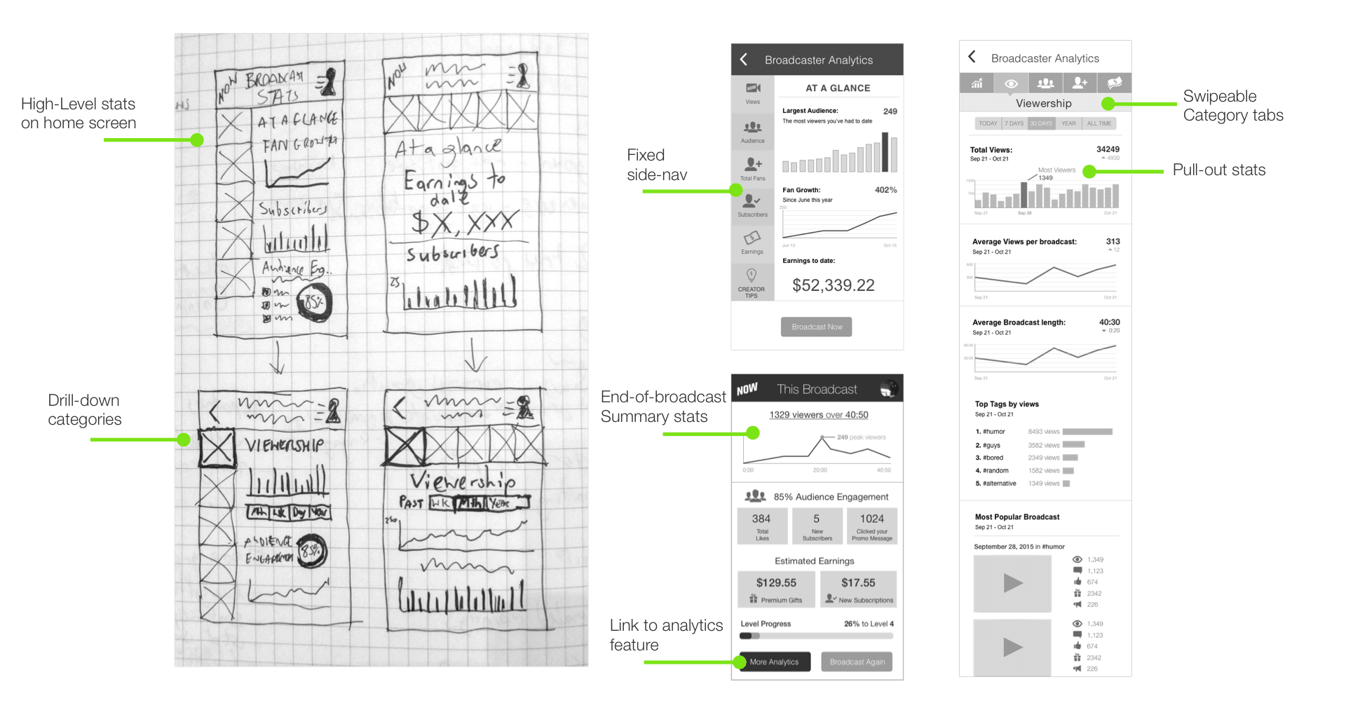
After kick-off meetings with key stakeholders, we decided to focus our efforts on the mobile experience initially. This included input from data and engineering to ensure features were within the realms of possibility, along with product management ensuring the features met strategic business goals. I began exploring rough concepts for the mobile layout, which proved useful as discussion points for defining more specific details with our vertical team.
- Provide at-a-glance stats while allowing opportunities for deep dives.
- Consider various entry points of opportunity within the app for discovery.
- Provide a positive experience and encouragement for broadcasters to continue using YouNow.
- Focus on the mobile experience initially, scaling to the desktop site in the future.
User Research & Interviews
I followed these tests up with user interviews to understand more broadly, their motivations and goals for broadcasting on YouNow. What were they trying to achieve? This proved to be a valuable exercise and expanded the product scope beyond just quantitative insights, to incorporating opportunities to connect more intimately with fans, a value at the core of YouNow’s offering.
USER INSIGHTS
“I expected to see individual broadcasts as well as the overall trends”
“My biggest goal is keeping the audience engaged at all times.”
“I want to see if big important people are viewing me, like verified people on Twitter”
KEY TAKEAWAYS
Defining the UX
Information Architecture and User Flows
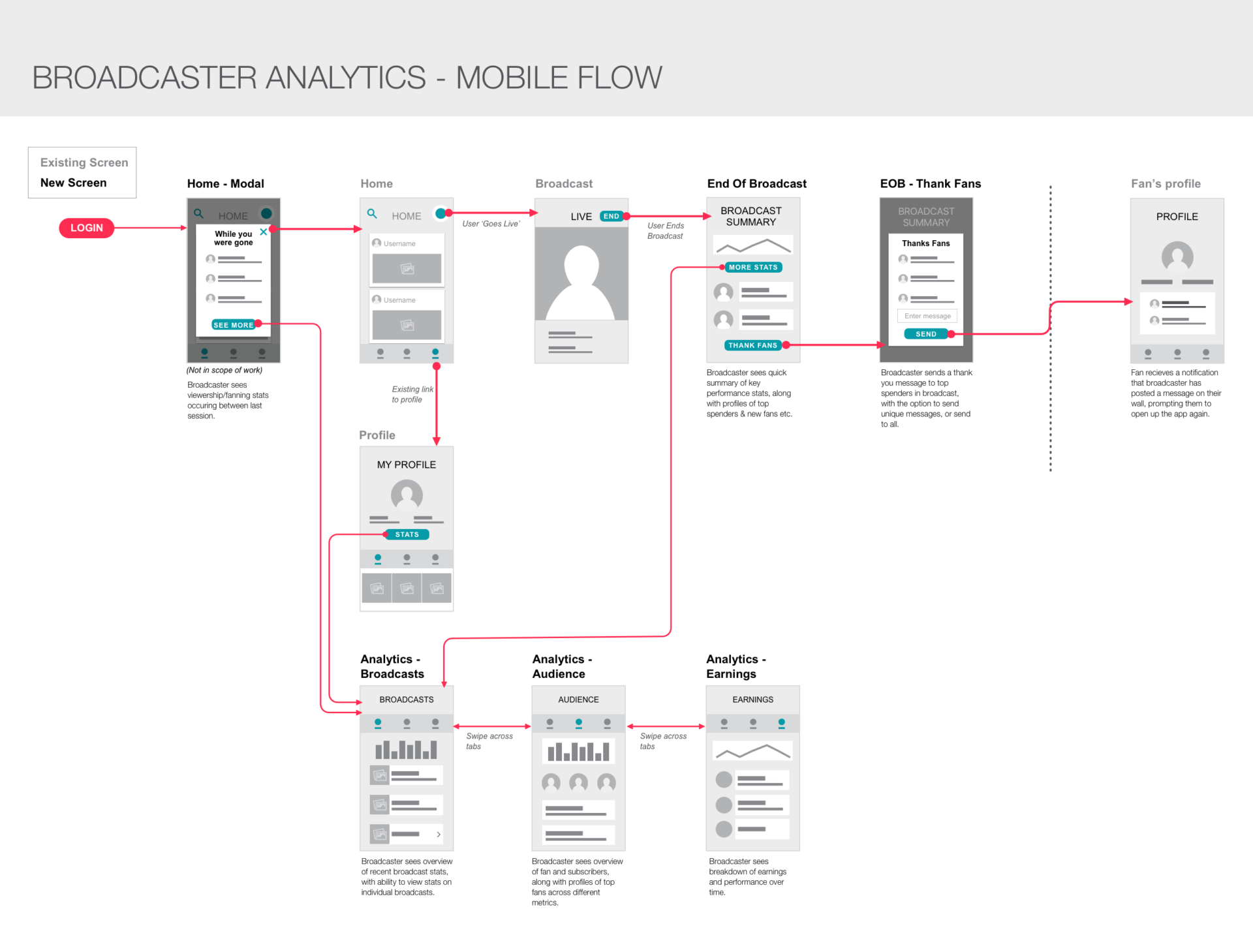
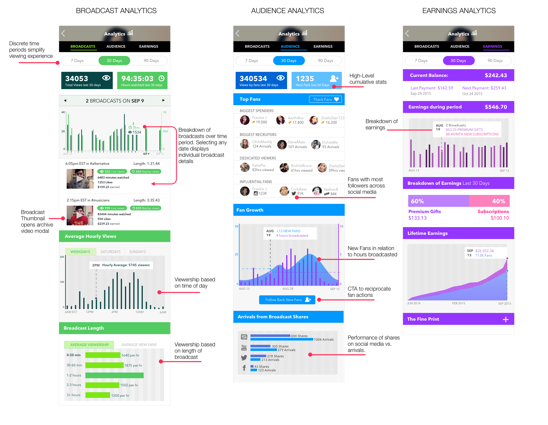
With user research insights in mind, I created a flow chart to visualize the interactions and touch points where a broadcaster would expect to encounter insights within the existing model. This allowed users to see snippets of high-level stats in their normal usage of the app, with CTA’s to dive into more in depth analytics. I also introduced ways of strengthening the relationship between broadcaster and audience, by providing opportunities to personally thank and ‘follow back’ fans at the end of a broadcast.
End of Broadcast – Mobile Annotations

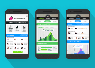
Broadcast Analytics – Mobile Annotations
During user testing, some users were overwhelmed by the separation of information into 5 tabbed categories. I simplified this by combining fans and audience into one category, and making broadcasts the default overview screen. Separating the sections into distinct colour schemes meant there was a clearer delineation between the types of insights to expect in each section.
Invision Prototype
Delivering an MVP
Card Sorting
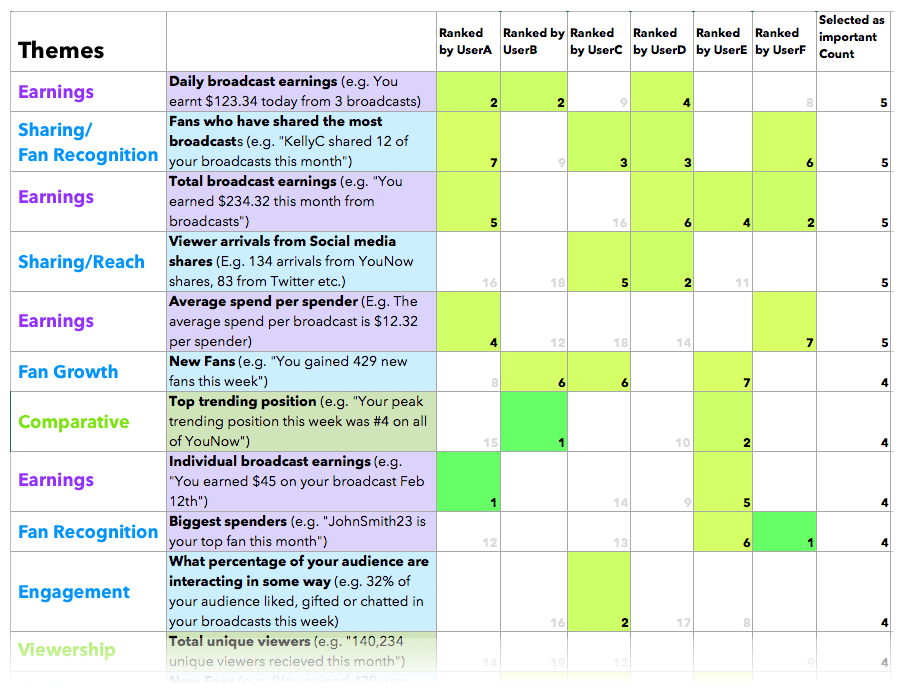
To identify which insights were most important to users, I conducted a remote card-sorting exercise with broadcast partners, using Trello and Google Hangouts. I created a set of ~60 insights and asked participants to drag the insights they felt were important to them into a separate list, and then rank them in terms of priority.

End Of Broadcast Desktop
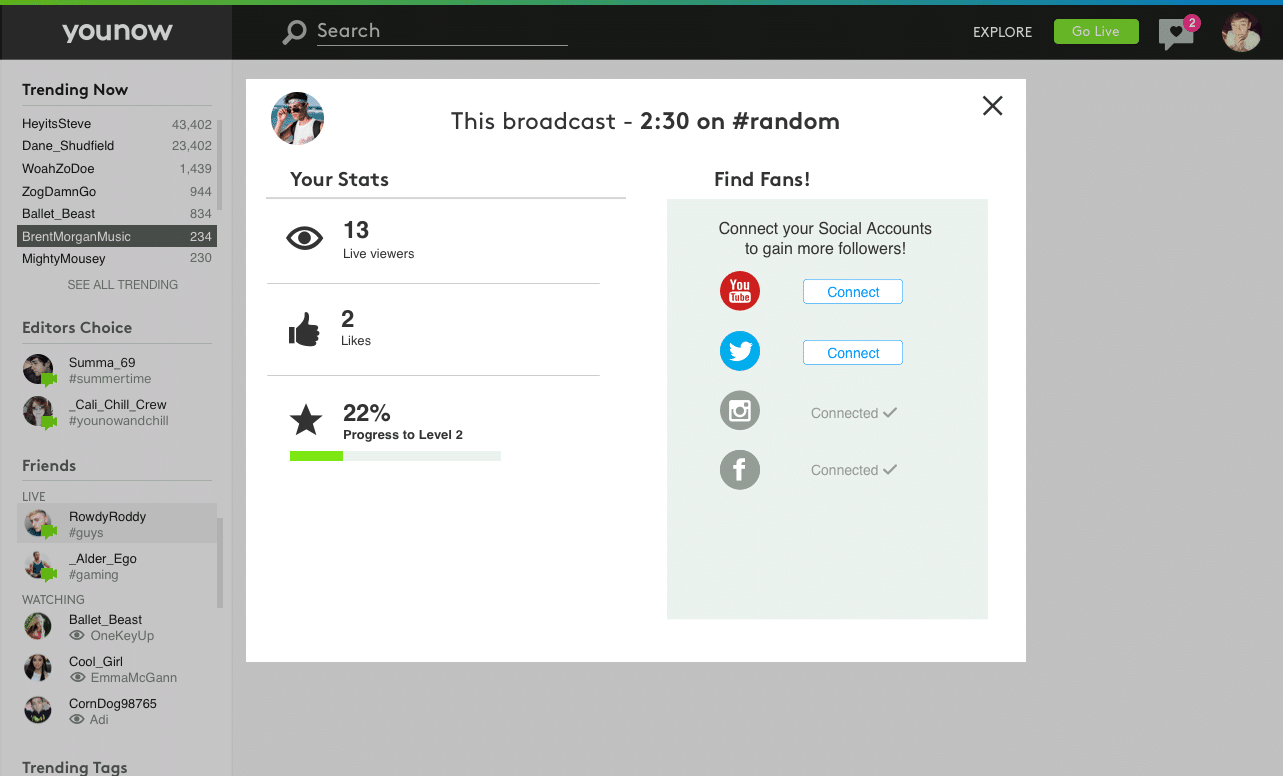
To create the an end-of-broadcast experience, we had to roll the feature out to both partners and non-partners alike. This was a challenge, as while partners had a high level of activity and interaction in broadcasts, a vast number of users had very little. To create a positive experience regardless of interaction, I included a CTA to connect social accounts to encourage broadcasters to grow their audience from outside of the YouNow community.
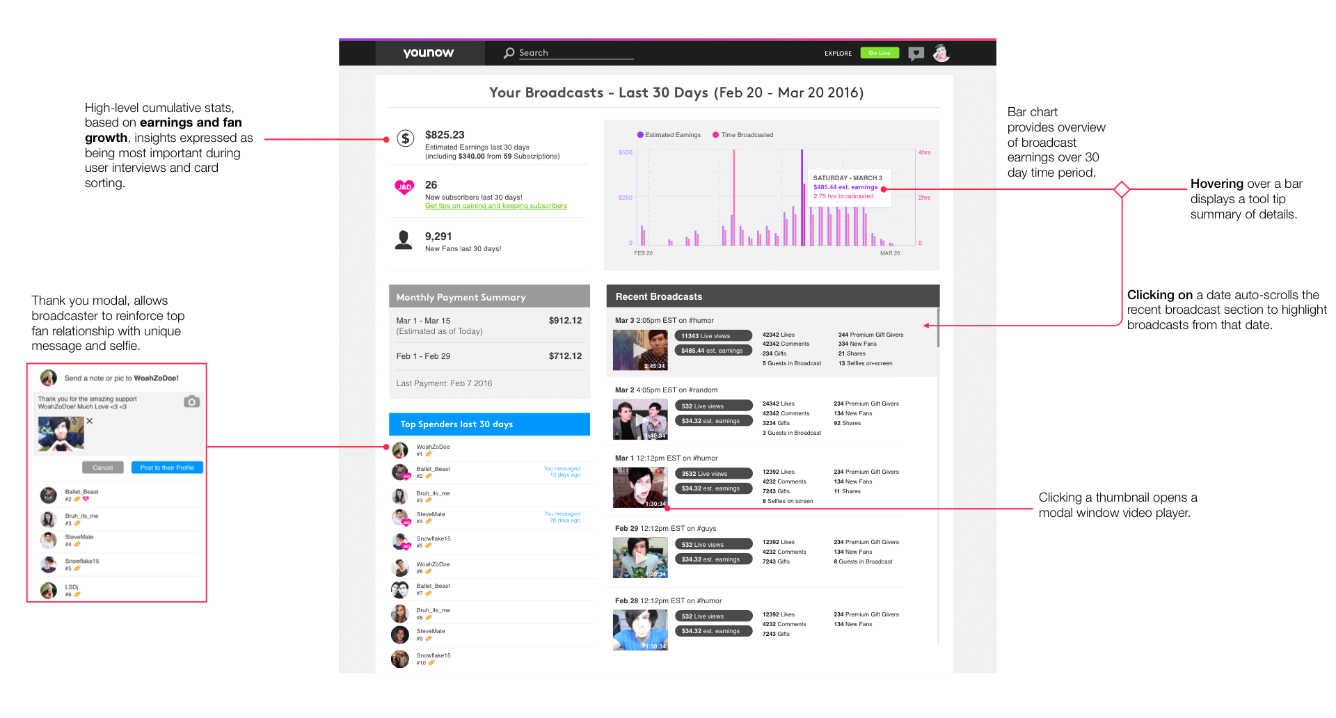
Broadcast Earnings – Analytics Desktop MVP
The Analytics MVP was initially rolled out exclusively to partners and was built upon redefining the existing ‘Estimated Earnings page’. To keep the MVP manageable, we focused insights on broadcasts and earnings over a fixed 30 day time period, enabling partners to see both high-level performance, and drill down to specific broadcast metrics. In addition, providing a list of top spenders over a time period, allowed broadcasters to keep track of their biggest supporters and thank them in meaningful ways.
Next Steps
The MVP was positively received by partner group we tested with and will be rolled out to all partners in phase two. The end of broadcast ‘thank fan’ feature had a modest effect in increasing audience retention. In terms of next steps, expansion is dependent on data and engineering resources, with the aim to:
- Include a chart in the broadcast summary reflecting audience engagement over time a broadcast. This would enable broadcasters to identify specific moments at which spikes in audience occur.
- Provide broadcast tips to based on insights to help broadcasters improve their performances and increase audience retention.
- Incorporate learnings from the end-of-broadcast and analytics tools into the mobile product.

