YouNow – Web Redesign

YouNow is an interactive live-streaming platform, where audiences can connect and participate in broadcasts through features such as live-chat and video guesting. Designing harmonious experiences for both the desktop website and iOS/Android mobile apps was a challenge, particularly when introducing new features that translated between all platforms.
The YouNow.com redesign project involved accommodating a number of asynchronous features within a live-platform, as well as a visual refresh to reflect the new brand identity.
- Conducted a site audit and remote user-testing to identify key issues with the existing site.
- Explored numerous visual directions to incorporating a new brand identity into the website.
- Sketched concepts and wireframes, designed clickable prototypes and provided annotated specifications.
- Worked with a team of three web developers, providing design QA and guidance to relaunch the site within three two-week sprints.
- Provided a roadmap for next-steps, designing conceptual screens that envisioned a more immersive user experience.
Background and Research
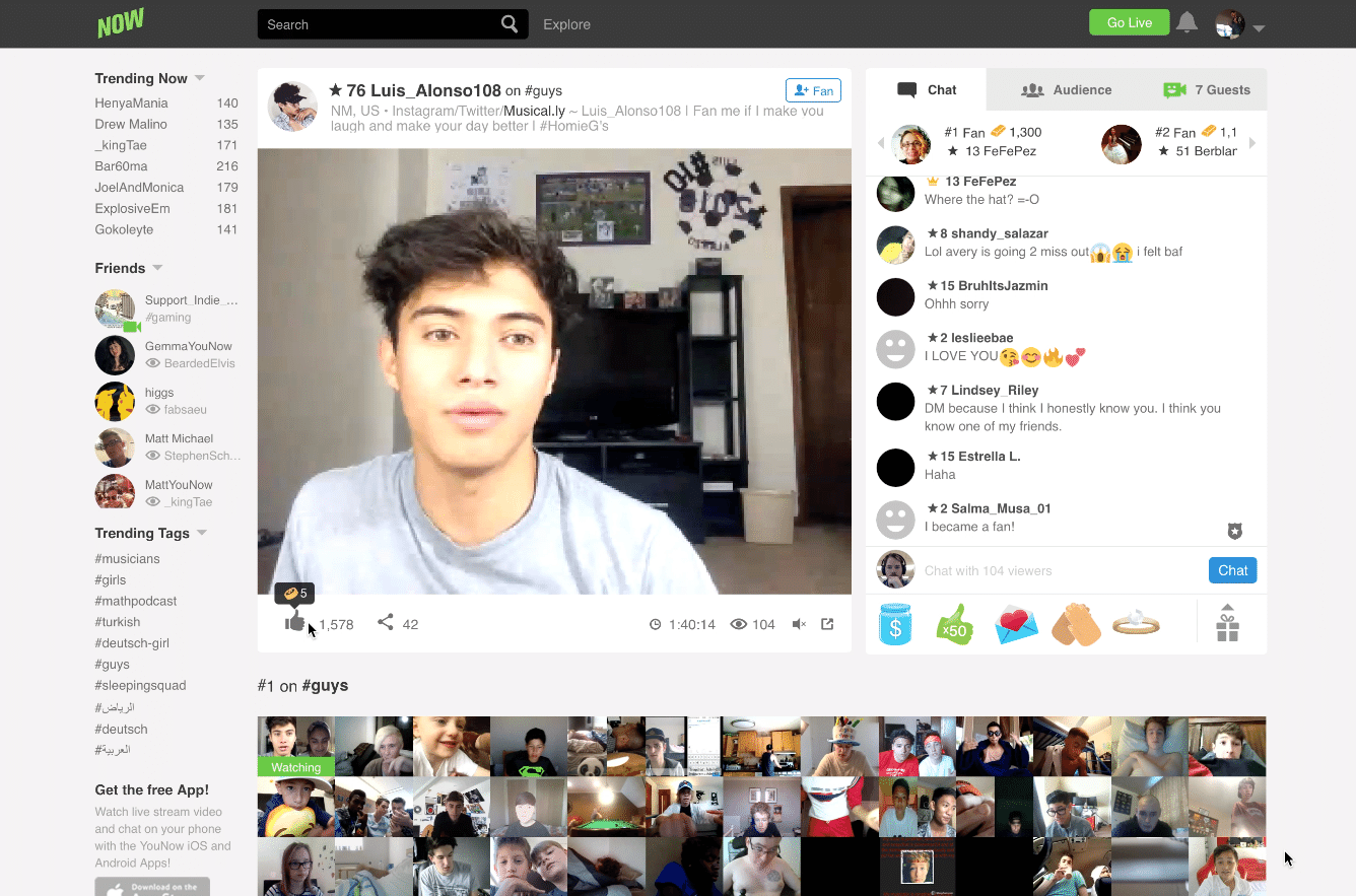
The Existing Site
BACKGROUND
Prior to designing, I conducted a site audit to better understand the key issues from the user, developer and product perspectives. This allowed me to undertake a redesign within a manageable scope, while separately exploring blue-sky conceptual thinking to improve the user experience in the longterm.
While there was a desire to improve the live-chat and broadcast experience, both user-testing and discussions with the product team, illustrated a more pressing need to improve the navigational and global elements.
PROJECT OBJECTIVES
• Integrate ‘Moments’ and ‘Leaderboards’ features into website.
• Improve visual hierachy and improve findability.
• Update visual aesthetics to reflect new brand identity.
• Launch re-design in tandem with mobile app within a 6 week timeframe.
• Provide conceptual vision for future roadmaps

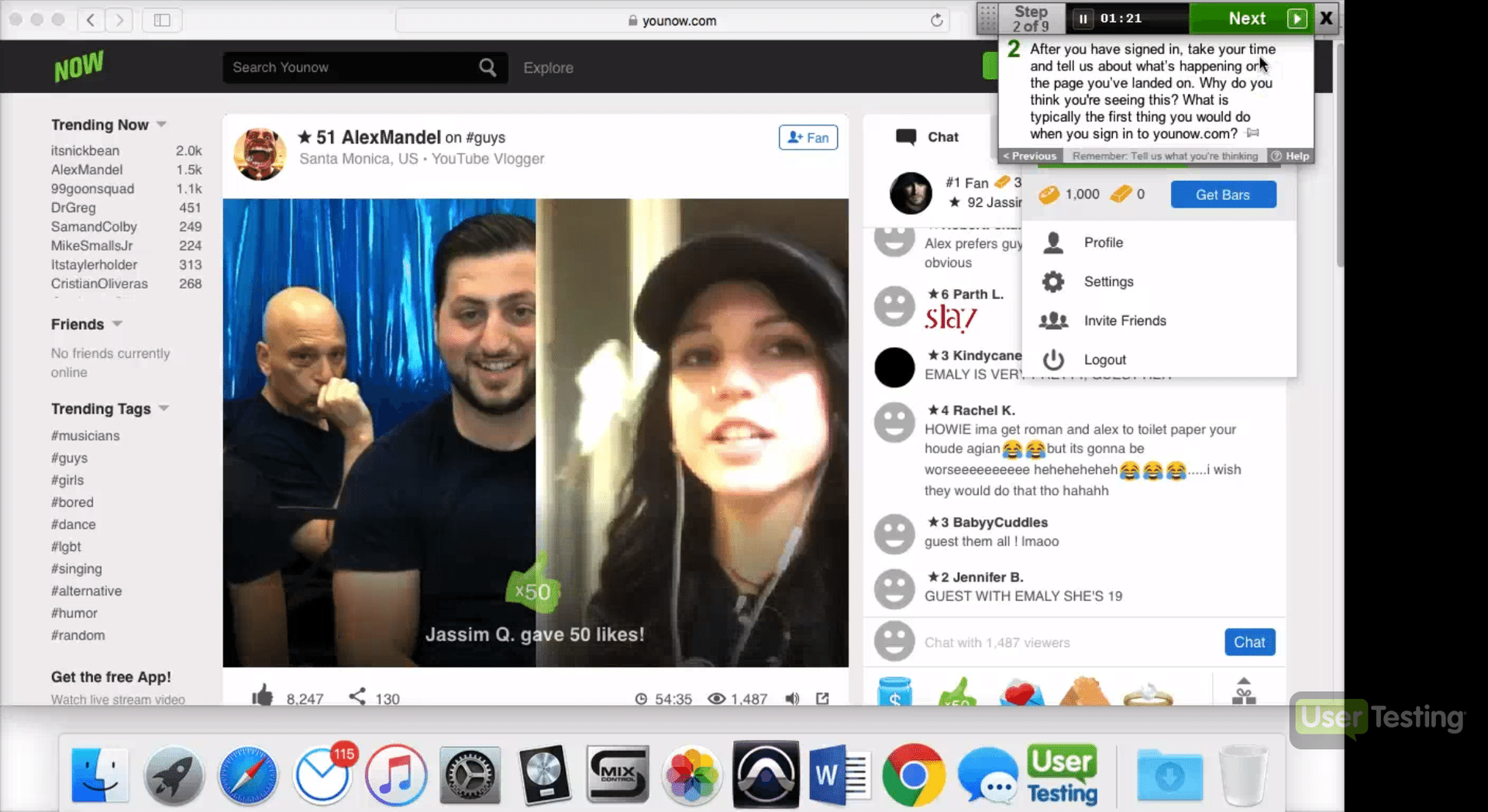
User Testing
I conducted user testing remotely using usertesting.com, and screened participants to understand the different experiences of both first-time and existing users, as well as identify common usability pain-points, particularly as it pertained to navigating the site.
USER TESTING INSIGHTS
- Most users, regardless of experience with the site, were frustrated by competing UI elements
- Existing Users predominantly sought out live content using the ‘Trending Broadcasters’ and ‘Tags’ section in the side-bar.
- First-Time users had trouble navigating and understanding where they were on the site, and utilised the search bar to find topics
- First-Time users in particular, were overwhelmed by multiple gamified features that are never explained (such as coins, bars, gifts and levels)
Site Map
I created a site map to enable us to visualize the pages by content type. As well as a tool for communicating changes to stakeholders and team members, the color coding of page categories was eventually integrated into the UI to provide the user with a visual cue, assisting with wayfinding.

Designs & Variations
Brand Identity Integration
I worked with conceptual style guides and assets to apply the new identity to the website.
The previous color palette consisted of predominantly green and grey, so integrating an expanded color palette provided the opportunity to delineate between different sections and functions of the website.
Working with a full color-spectrum, I was also mindful of using color sparingly during the design process, to allow the user content to take center stage.
The brand guidelines used Brown Pro for the typeface, which I incorporated for headings to give the site a more modern feel, while pairing with Helvetica Neue in body text and chat for its readability attributes.

Global Navigation

Navigation Variations

VARIATION 1
I explored removing the top navigation entirely, to integrating the navigation to a ‘sticky’ side navigation bar, which would facilitate a more immersive experience. Ultimately this was not possible within the scope and timeframe of the redesign project.
VARIATION 2
This option utilised a thin band of colors within the brand palette to categorise new pages on the site, while retaining the sidebar to expose live trending broadcasters and hashtags. This was seen to be the most balanced and achievable direction within the timeframe.
VARIATION 3
I used full-width gradients across the top nav to provide stronger wayfinding visibility. I retained and enlarged the full search bar for an immersive search experience, while moving page navigation into the sidebar. Ultimately, the trade off meant deprioritizing trending content, and the nav-bar was very pronounced which could distract the user video content being viewed.
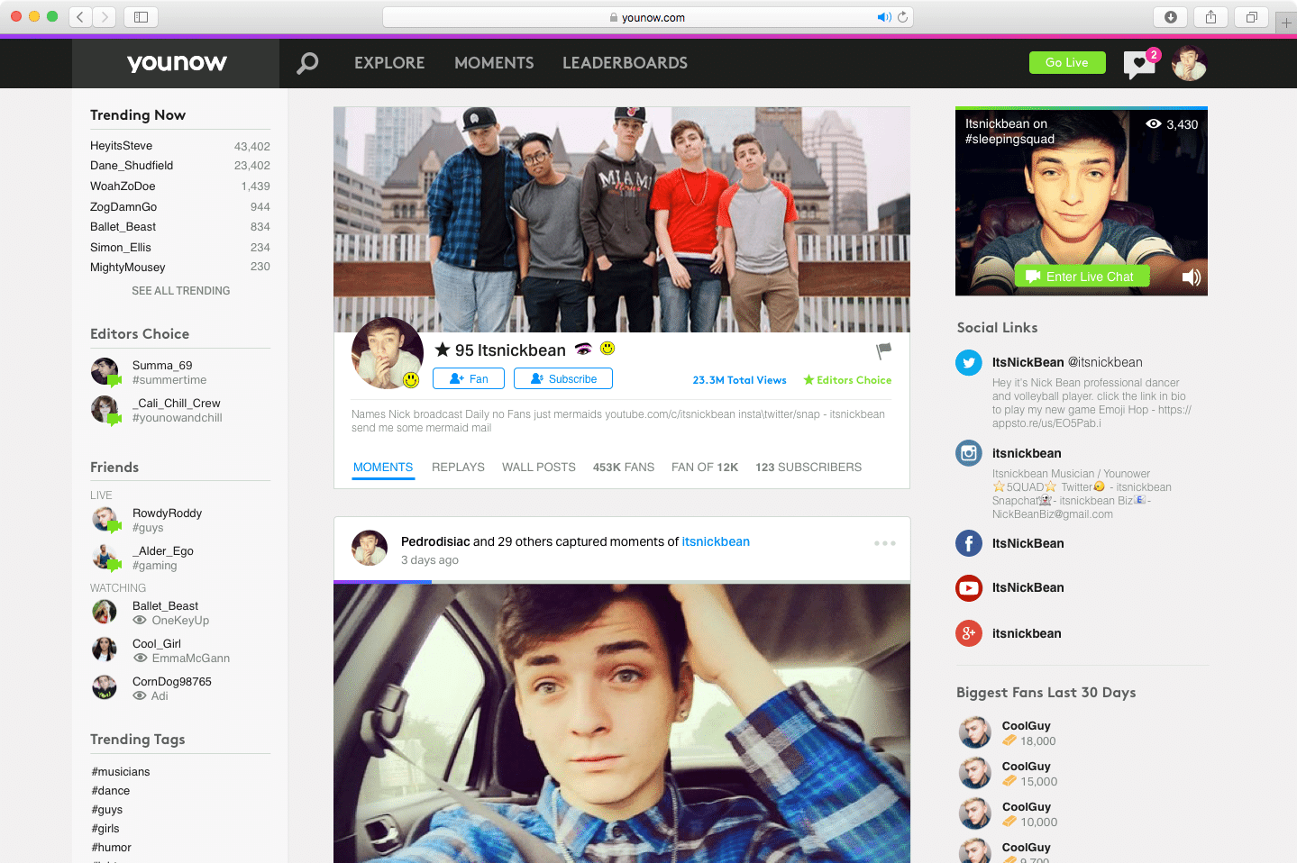
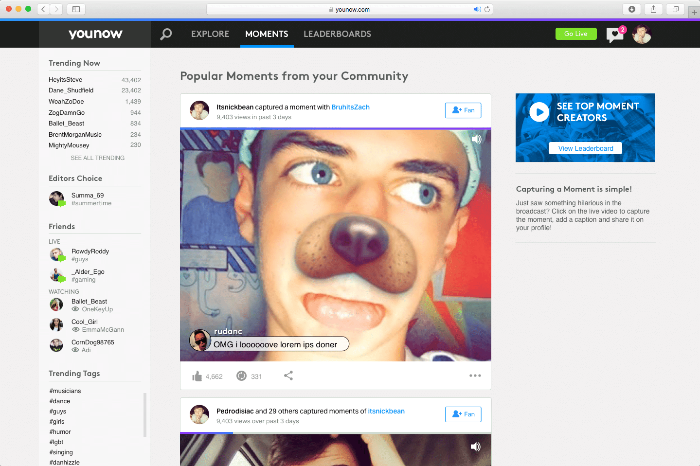
Previous Search Bar
During user testing, first time users in particular were confused by search bar and the explore page link. After entering a search term, some users didn’t realise ‘Explore’ was a separate page link, and clicked on it expecting to be taken to a results page.

New Search Bar
To reduce confusion, I positioned the search icon next to the navigation links and introduced a slide-out overlay for the search bar, which provided a more immersive search experience. I also added section titles to the auto-complete results, to delineate between Live and Offline users.

Previous Notifications

Improved Activity Feed
- Highlighted new notifications within feed
- Added chiclet icons to signify the type of notification
- Added content thumbnail to provide more context
- Extended height of activity feed to provide more visibility and improve the scrolling experience for the user
New Activity Feed

Prototypes
Version 1
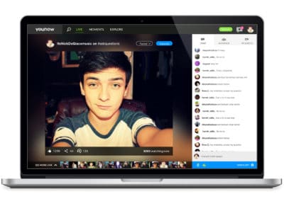
With the first prototype, I aimed to expand the site from fixed to full-width. This would provide a more immersive experience for the viewer. I also included dropdown menus in the navigation and slide out trays for notifications, to provide the user with a more robust method of exploring content, without missing the content they were currently viewing. Ultimately, due to technical constraints, a full-width repsonsive page was not possible in the existing project, but was earmarked to explore in further depth for future iterations.
Version 2
In the second version, I illustrated how the site might operate within the constraints of a fixed width experience. I introduced a color system to represent the types of page content. I also explored a card system for the moments feature. Initially this would live on a users profile, displaying moments they had captured in broadcast, along with moments they appeared in.
Moments Card
With the need to surface Moment highlights on various sections of the website, I opted for a modular and reusable card design. I prototyped the interaction of a moment, which would play automatically and loop when in full view of the browser screen.
Version 3
In this version, I refined the search interaction, and introduced the Leaderboards and global moments features into the navigation bar. This prototype was ultimately where the designs landed and the result of a pragamatic trimming of explored features to those that were most achievable and impactful in the time-frame.
Final Specifications & Results
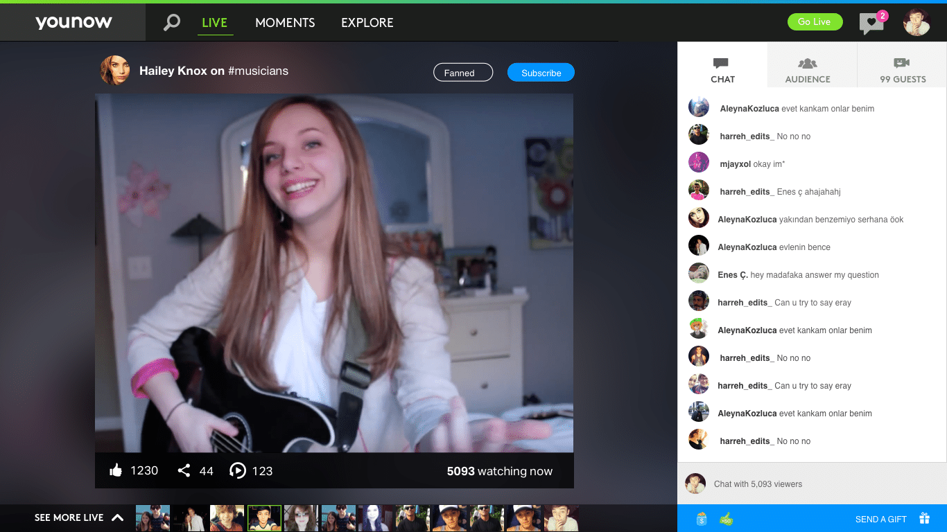
Live Broadcast

Profile Page
Moments Feed
Leaderboards

Results
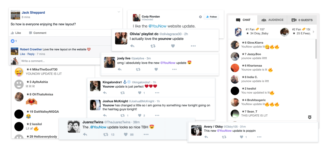
The website redesign, along with the introduction of Moments and Leaderboards, was executed within three two-week sprints and launched in tandem with the redesigned iOS and Android apps. While tracking quantitative data metrics following the redesign was crucial to assessing its impact and making iterativ improvements, gaining the approval from the YouNow community was also imperative. The initial response on social media and in the YouNow broadcasts was predominantly positive.
Next Steps & Conceptual Designs
Designing for an immersive experience
I began the exploration by focusing on the desktop viewer experience, with a number objectives in mind.
- Utilization of the full dimensions of the screen. The existing site architecture limited the page width to 1280px. The new design would expand and shrink content to fit the screen, as well as extend the chat module to the bottom of the browser.
- Improve opportunities for content discovery. Considering the live nature of the site, exposing relevant and trending content to viewers needed to coexist within the live viewing experience. I explored methods of navigating trending content to users while not overly distracting from the content they were currently viewing.
- Reducing UI clutter User testing had shown that first time users in particular were confused by multiple competing elements on the screen. Reducing the UI elements to only those pertinent to the users current objective, would potentially help provide clarity and reduce confusion when viewing content.

Live Viewing Experience
Live Trending Exploration module