BBC Technologies – Blueberry Sorting Interface
PROJECT OBJECTIVES
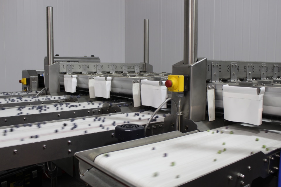
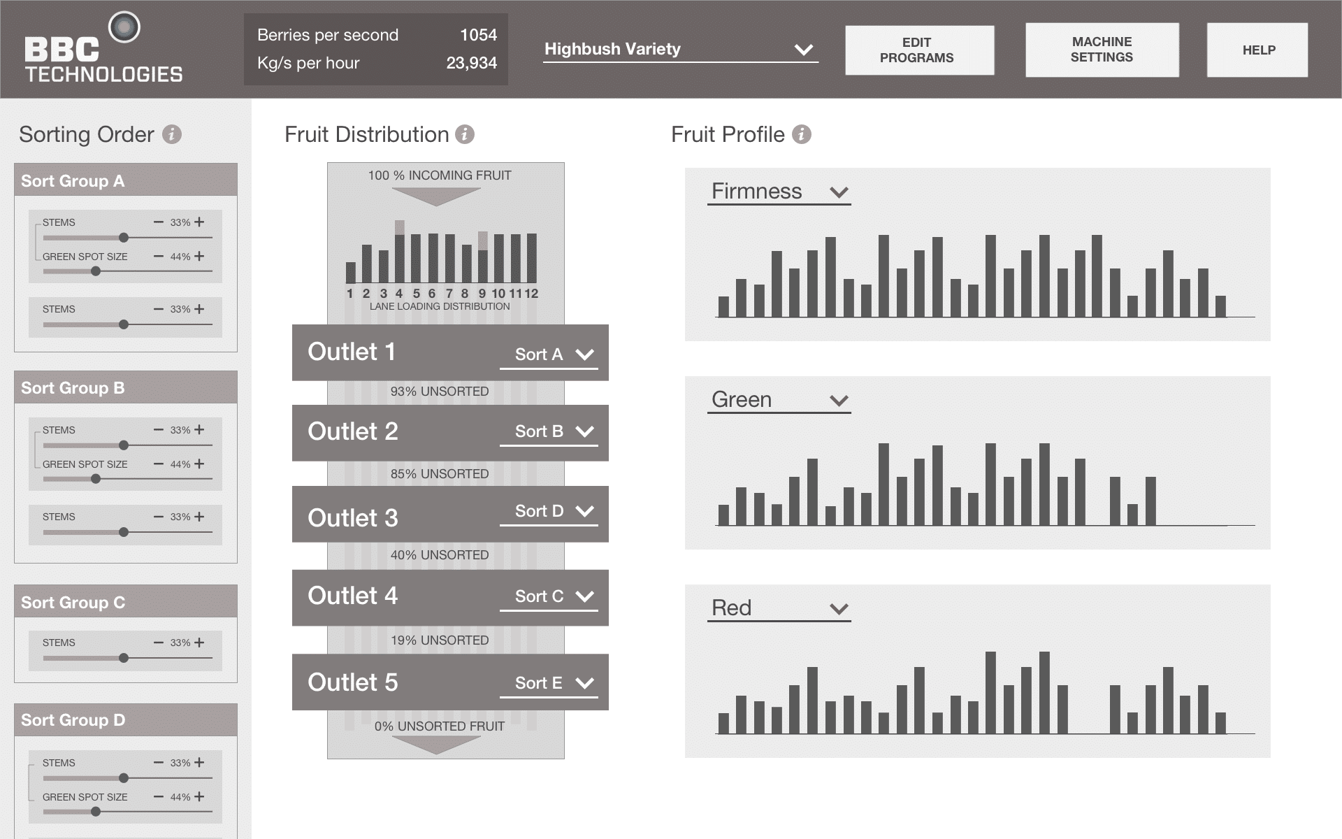
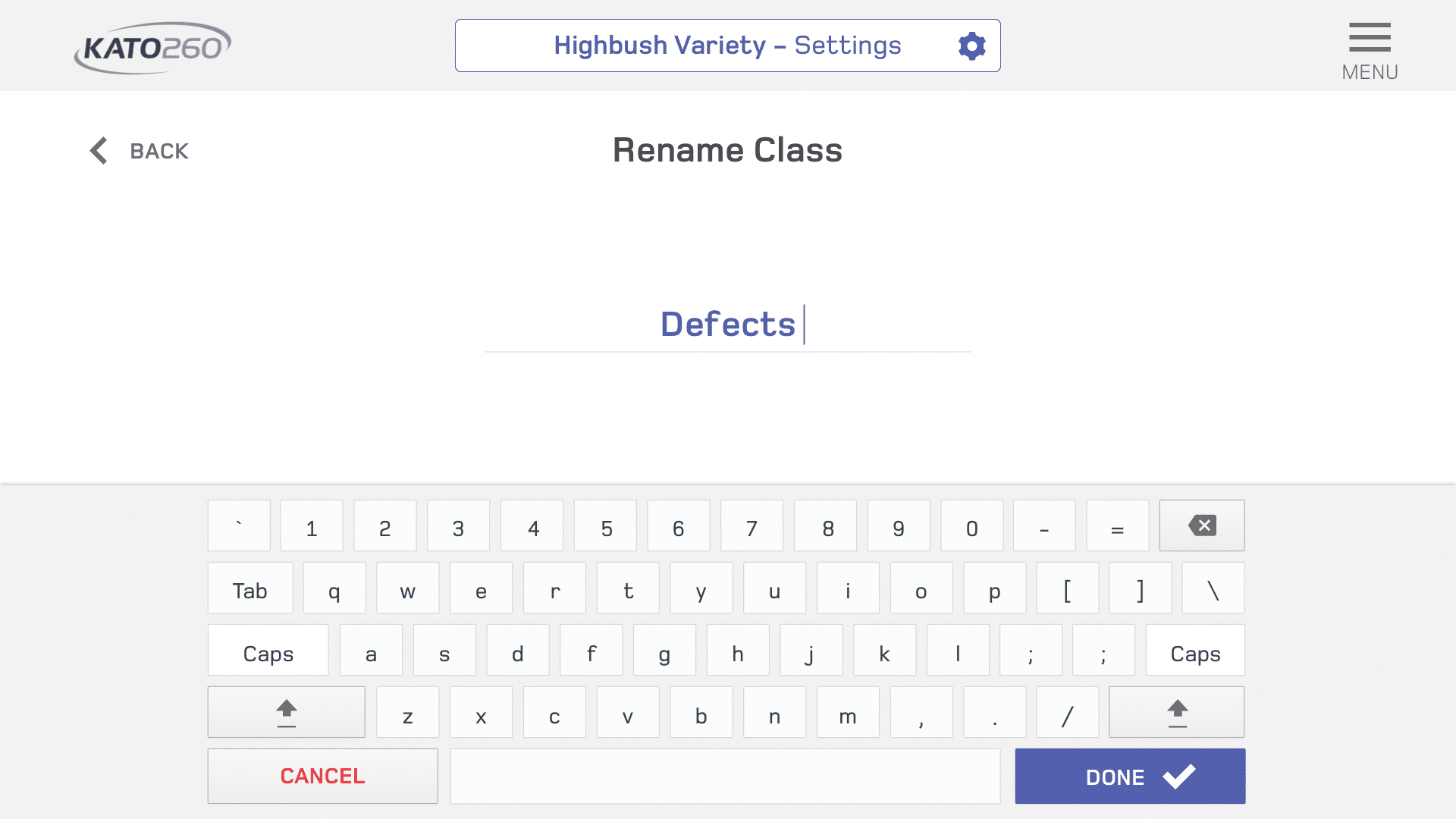
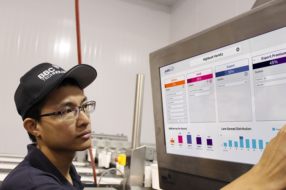
The KATO-260 Sorter is a precision grading and sorting system designed for the fresh blueberry industry. While the machine has powerful capabilities to precisely analyze and categorize fruit based on multiple attributes, the original user interface was confusing and intimidating to packhouse operators and managers alike.
I was tasked with fully redesigning the touchscreen interface and ensuring a range of users could clearly understand and utilize a complex sorting system for their needs.
MY ROLE
- Led design process through all stages, from initial user research to delivery of detailed specs.
- Worked remotely with two engineers and a project manager, to completely rebuild the touchscreen interface for the KATO blueberry sorting system.
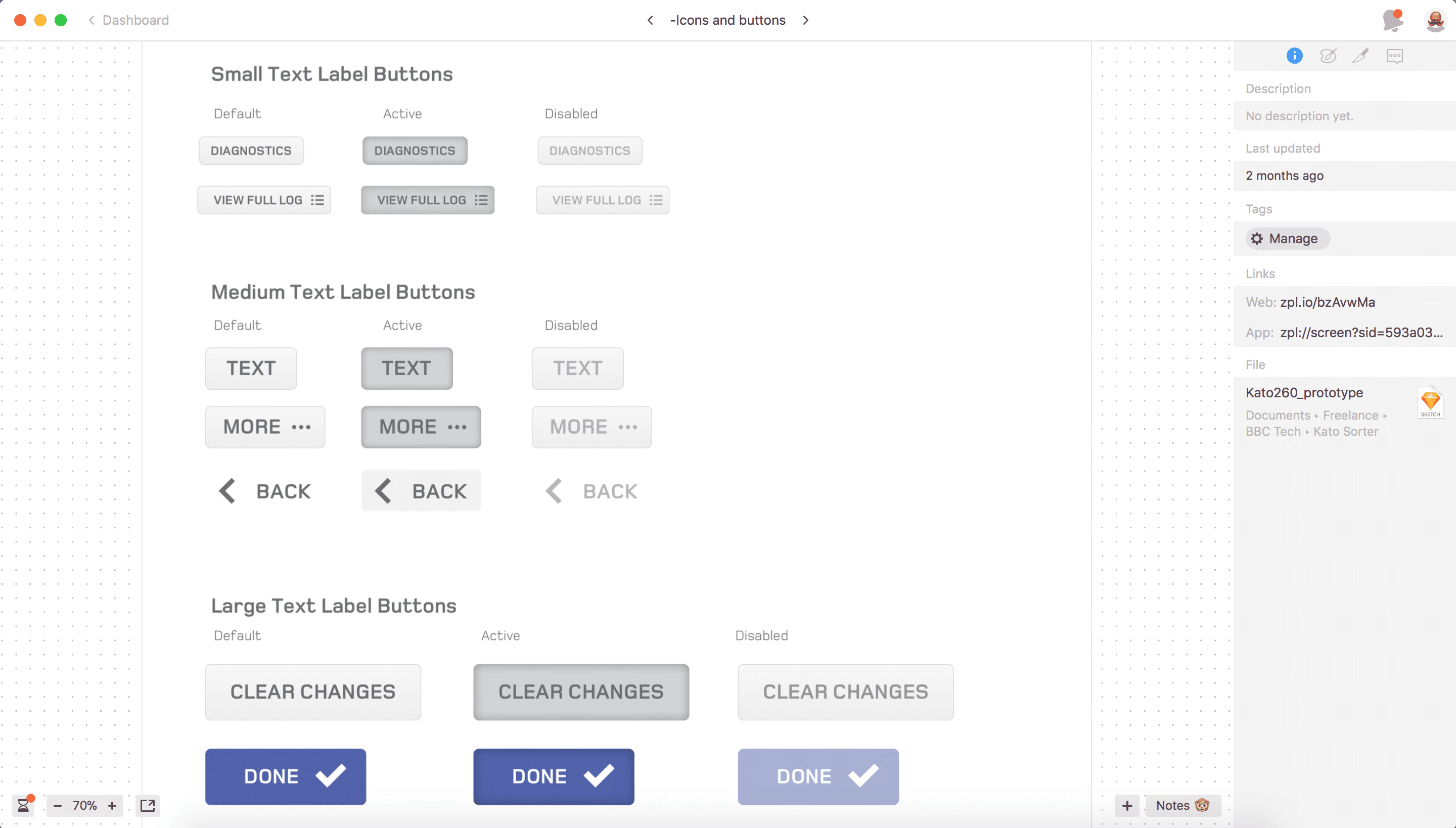
- Created a design system of reusable components and styles to efficiently scale the product and maintain consistency.
- Gathered user feedback post-launch to help inform and prioritize future product enhancements.
Background and User Research
I started by spending time with the engineers who had developed and designed the sorting system to thoroughly understand how the sorting structure operated, what engineering constraints existed that would affect the scope.
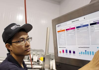
I also visited farms to meet with blueberry packhouse managers and operators to observe their use of the machine in the field, and to better understand their grading needs.
From discussions and observing operator
“I just need a good overall picture of the fruit on my packing line”
User Personas
Machine Operators
Packhouse Owners & Managers
Support Technicians
Initial Concept Exploration
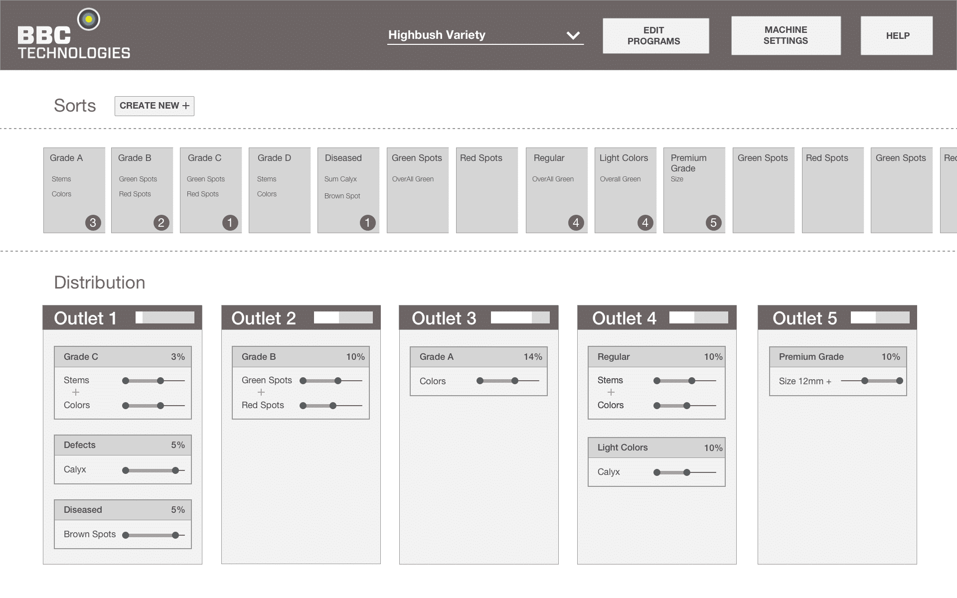
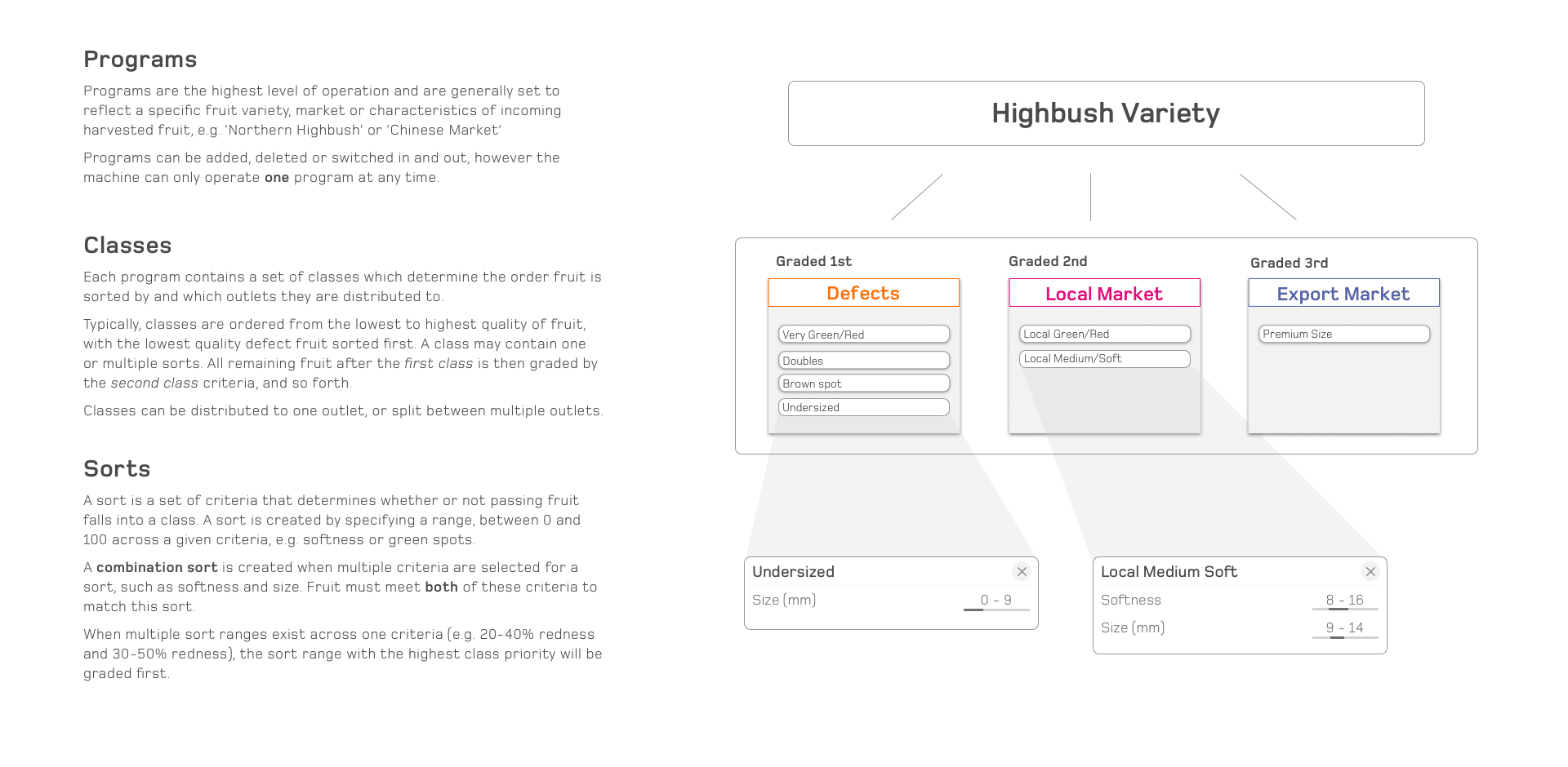
Redefining the Sort Hierachy
Since customers generally spoke in terms of quality grades for their fruit, I proposed introducing a secondary level of sorting classification, (later changed to ‘Classes’ to be less prescriptive.) This would help provide a clearer distinction of sort
Site Map
With a complex application and as the only, it was important to maintain a high-level
This was living document which was updated as progress and any adjustments in product direction were made.

Design Iterations
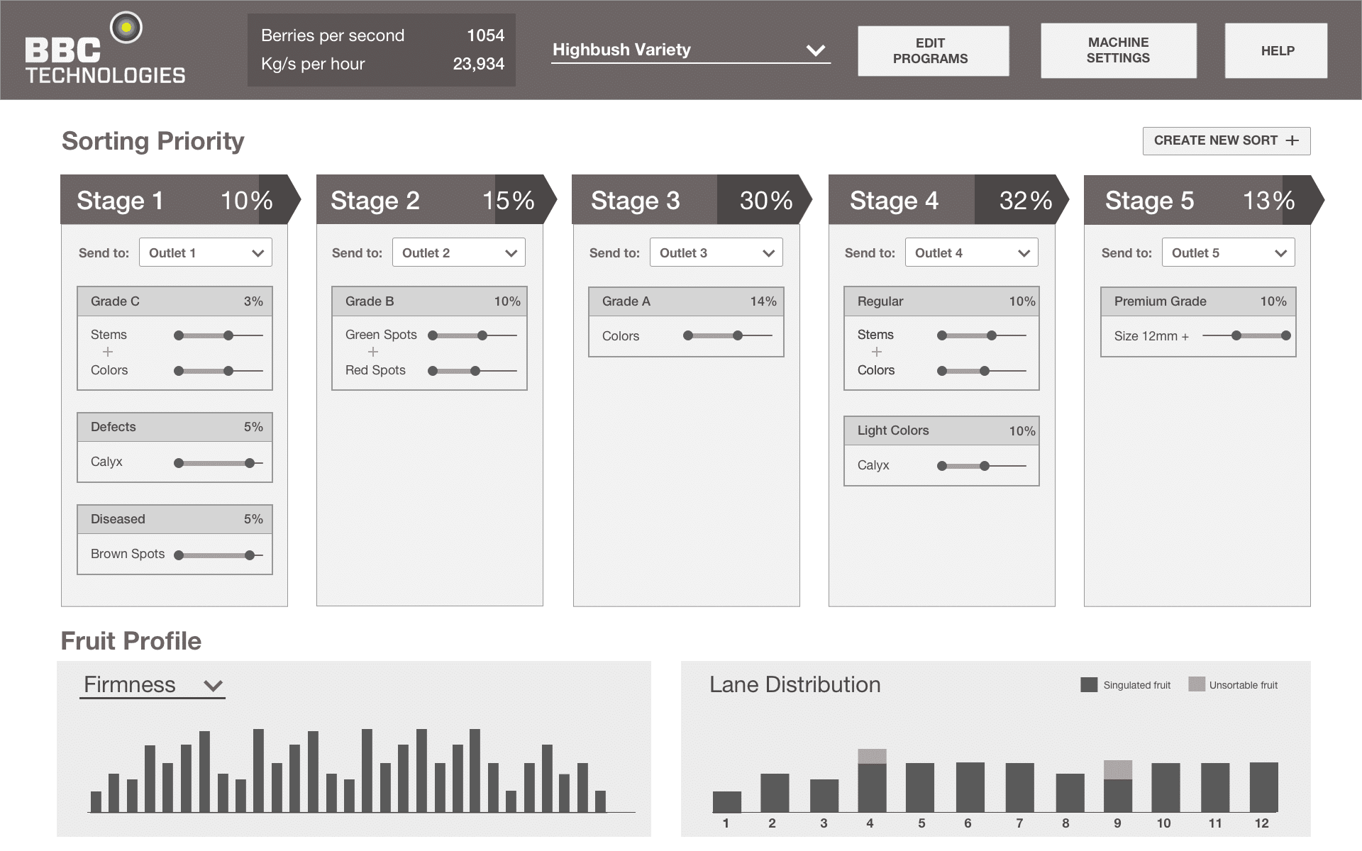
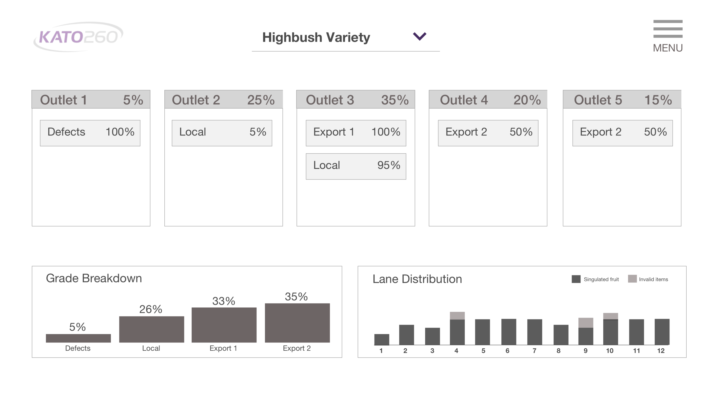
Dashboard Overview
Setting up and editing sorts
Clarifying the sort creation process was integral to ensuring users knew how they were
Creating a Sort User Flow
1. Select Sort Criteria ➝
2. Define Sort Range ➝
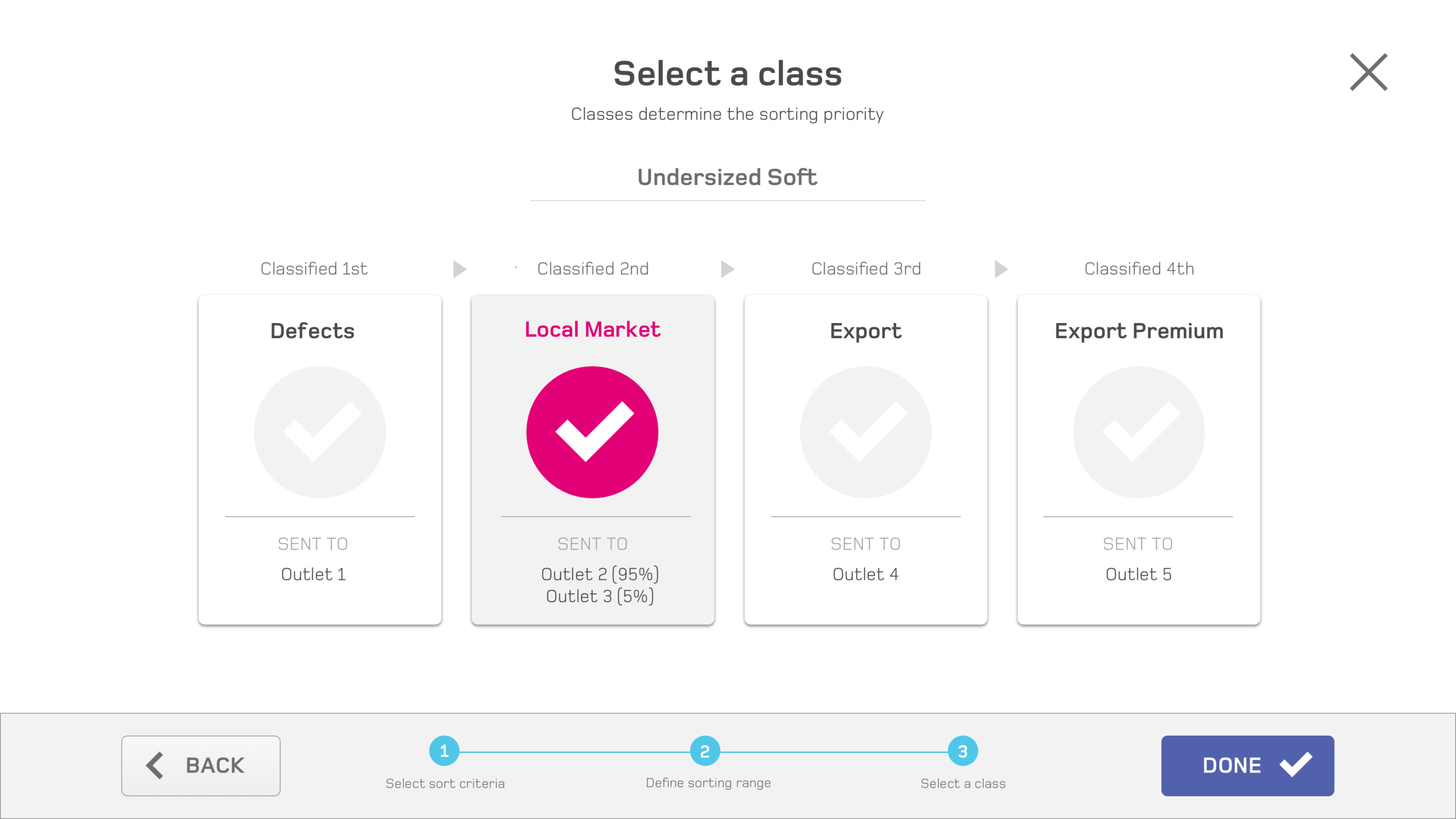
3. Assign Class (Grade)
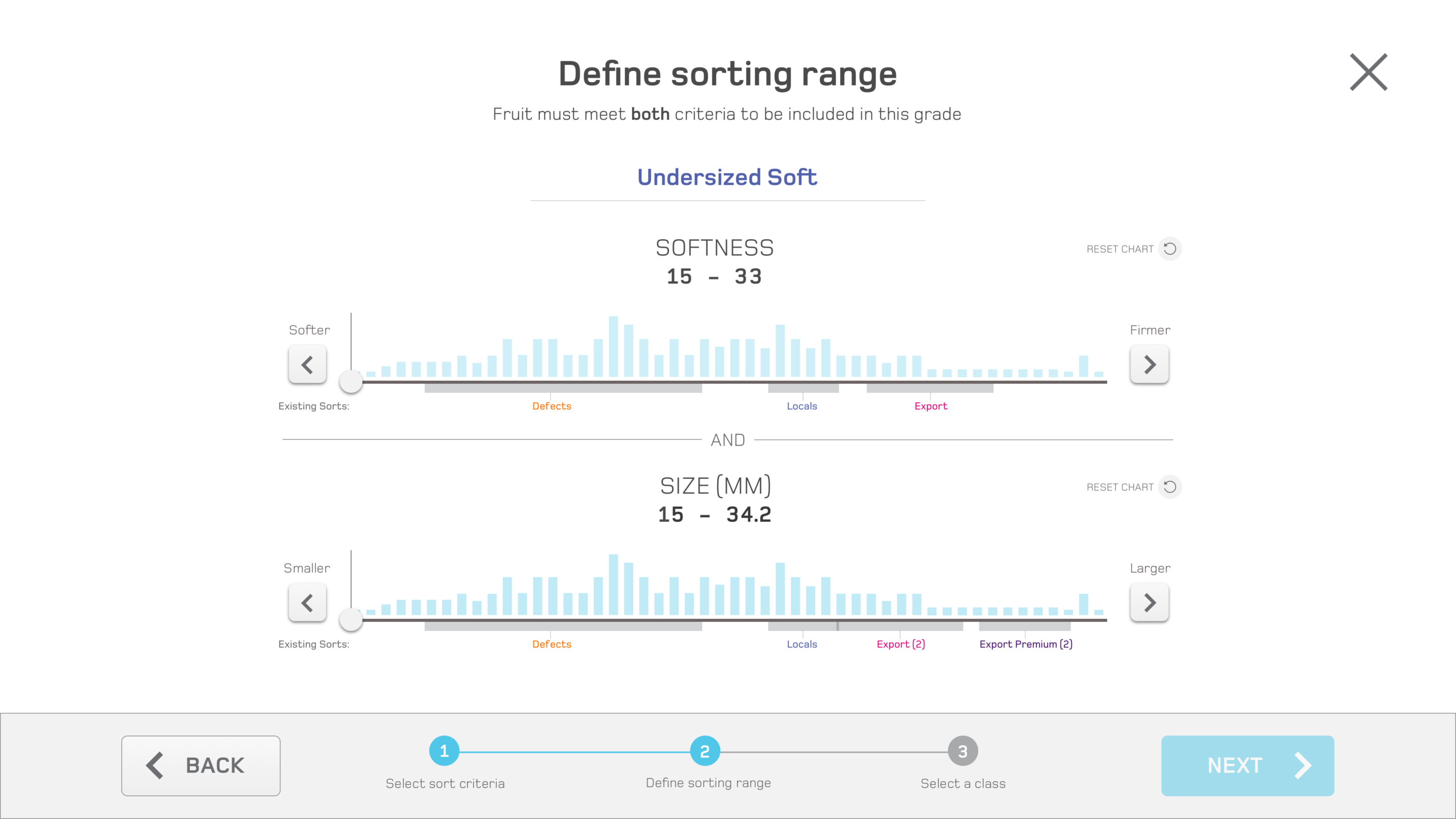
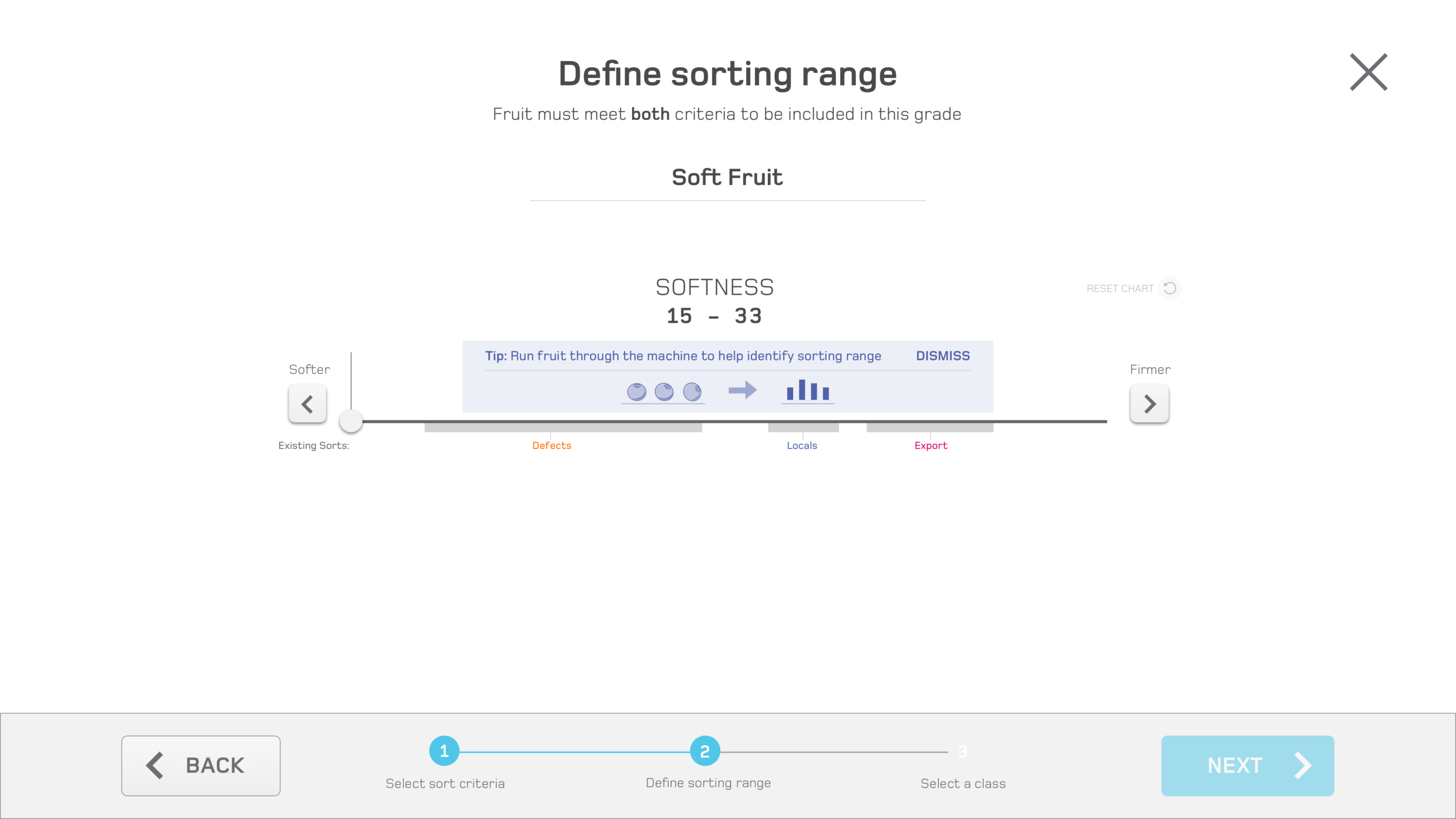
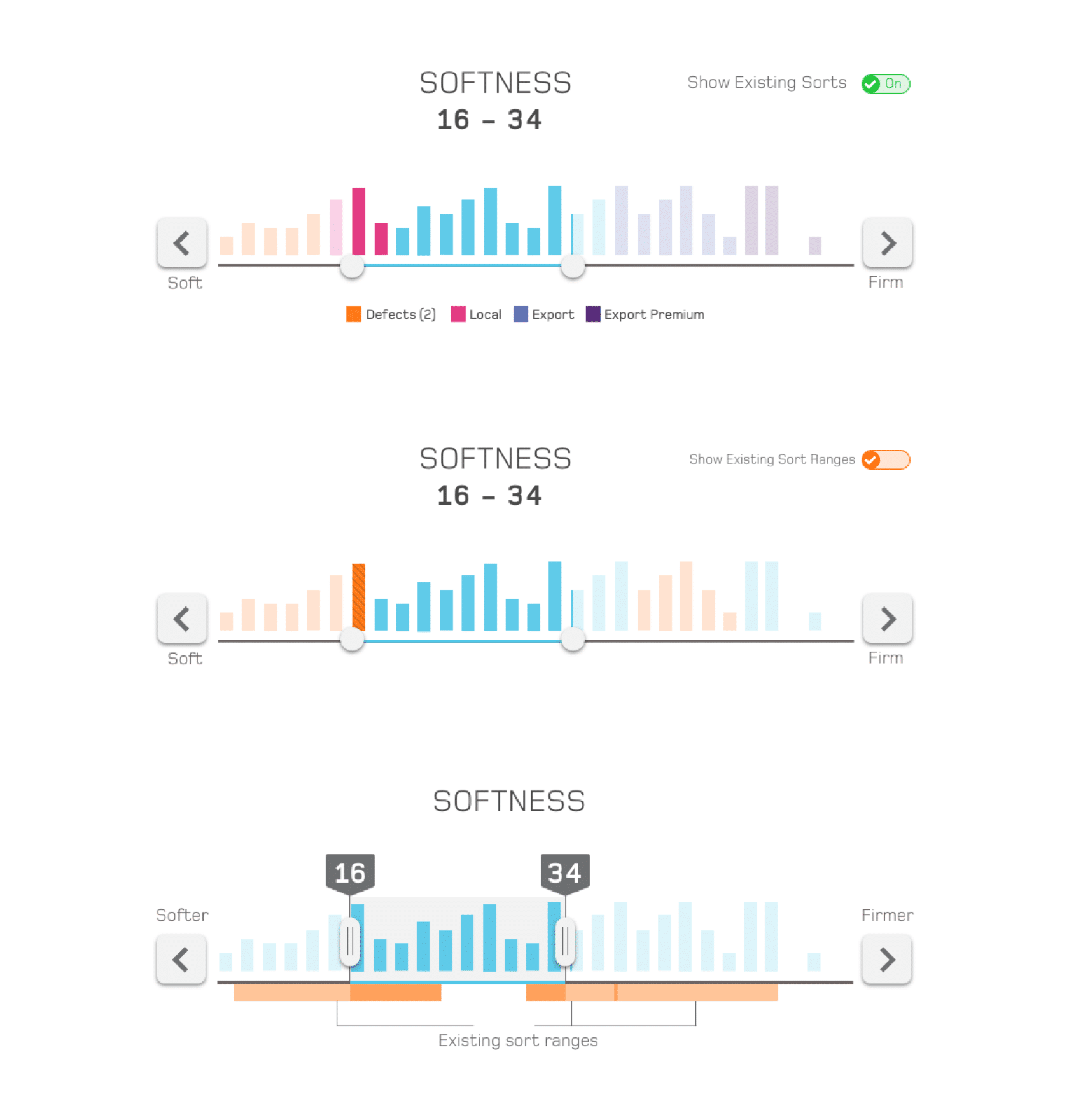
Defining sort range
In the previous sort setup, a lot of
Draggable Slider Variations
The Resulting Flow – Adding a New Sort
Building a scaleable design system
Reusable Components
With multiple pages and workflows to account for, utilizing reusable components and patterns was essential to maintain consistency with interactions and to streamline workflows for engineers
Style Guide & Specifications
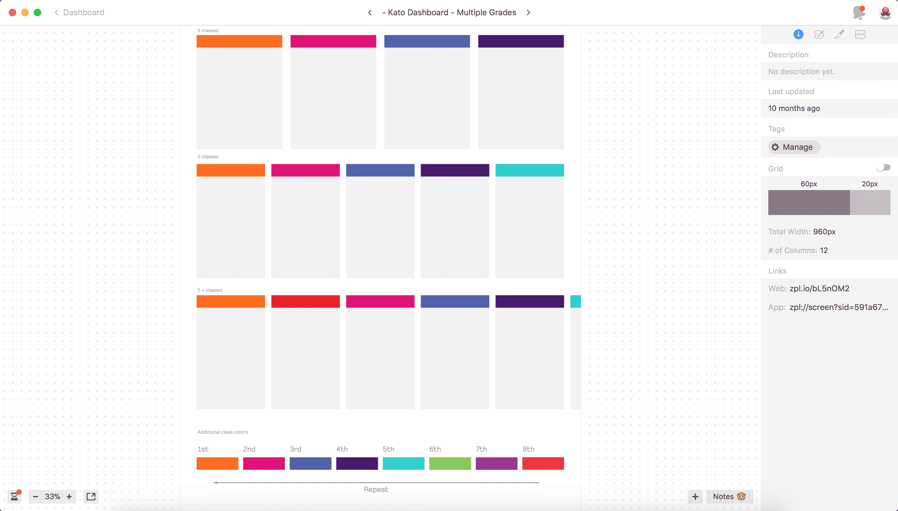
Working remotely with engineers, I used Zeplin to provide final specs to engineers, with a living style guide and the ability to export assets as required.
Color Palette

Launch and Next Steps
The updated interface was well received by users after its initial launch, providing packhouse managers and operators the ability to manage their fruit throughput with more confidence and ultimately deliver a superior product to their customers. BBC Technologies also showcased the KATO interface as the centerpiece of their tradeshow events.
Through user feedback and observations gathered by technicians at customer sites, a number of enhancements were explored, such as an advanced mode for fine-tuned sorting.
To continue providing a consistent experience across their suite of products, the touchscreen design system is also being explored for utilization in other UI applications, such as cherry sorting.
Concept for a two-dimensional advanced sorting mode.

