THE ORCHARD / SONY MUSIC
Design Sprint: Improving catalog management for music labels and artists
As The Orchard began to expand and diversify its user base, from independent labels to self-managed artists and large third party distributors, clients needed a more robust and flexible tool to manage their catalogs and plan their upcoming releases.
I led design efforts to revamp the existing catalog management page in The Orchard’s Workstation while strategizing and defining a longterm vision to scale towards.
My Role
-
Led redesign of Catalog page and efforts to define longterm vision.
- Worked alongside a Product Manager to conduct a one-week design sprint, involving product researcher, engineers and business stakeholders.
- Managed contributions from two product designers.
Objectives
-
Improve the speed and performance of content management workflows through optimized controls and access to key information.
- Deliver a scalable solution for artists with few releases through to distributors with large complex catalogs.
- Establish a blueprint for future design sprints conducted within the organization
Background
The catalog section of Workstation (The Orchard’s client facing suite for setting up and managing music releases) is a core component of a label product managers workflow in co-ordinating releases from setup through to delivery and release at music stores and services.
As the existing catalog management page was built upon legacy technology, the performance was incredibly slow and especially frustrating for labels and distributors managing and organizing catalogs with thousands of releases each year.
Addressing the performance issue became a high priority following strong feedback received from a number of high profile clients, including:
❗️Extremely slow page performance (average 20s page load)
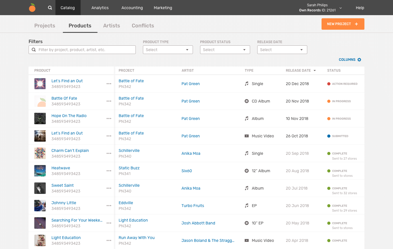
❗️Missing critical product information and metadata (product codes, projects, storefront links)
❗️Inconsistent releases statuses across product types (digital audio, physical and video)

Product statuses were inconsistent and unclear
Finding a product’s parent project requires navigating to separate page
Design Strategy
While engineering focused on rebuilding the front-end and backend technology to serve the page faster, as the product design lead, my objective was to ensure users experienced the perception of speed across their workflows. Providing more effective and efficient ways of filtering, sorting and accessing the information users needed to perform daily tasks was equally important as page-load speed.
There was a short time-frame before engineering was due to commence work and we needed to ensure we had an effective solution that would solve the immediate speed and performance concerns, while establishing a scalable long-term vision for the catalog management that anticipated the needs of new user types (such as artists) and functionality out of scope for the initial rebuild.
Working with a new product manager, I floated this as a potential candidate for a one-week design sprint – a design process periodically discussed amongst the organization but seldom acted upon. We treated this as an opportunity to both define and validation solutions in an expedited manner, while also documenting our learnings and artifacts as a resource for other teams in future design sprints.
Designing a product entirely from scratch is often a luxury position, whereas redesign projects require a balance of long-term vision setting and prioritizing practical steps to get there, while maintaining core functionality. With those thoughts in mind, I worked with Mike, a Product Manager, to coordinate our approach and set some high-level objectives for the design sprint:
Set a long-term vision to scale towards and anticipate future user needs
Deliver a feasible short-term solution to address critical performance issues
Share sprint learnings with the wider product and design teams and provide a framework for future sprints
Conducting a Design Sprint
🎨 🏃🏻♂️💨
Planning
I set out by drafting a sprint planning document, working with the PM to outline our goals and deliverables for the sprint, identify team members and stakeholders involved and schedule sprint activities. This would act as a grounding source of truth throughout the sprint, continually updated and referenced as we went. Our core team comprised of a Product Designer (me), a Product Manager and a Product insights researcher.
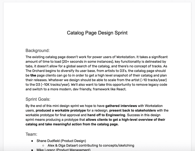

“By the end of this design sprint we expect to have gathered interviews with Workstation users, produced a workable prototype for a redesign, present back to stakeholders with the workable prototype for final approval and hand off to Engineering.
Success in this design sprint means delivering a prototype that allows clients to get a high-level overview of their catalog and take meaningful action from the catalog page.”
With a tight window to deliver a workable solution, along with limited stakeholder availability, we opted for a modified version of the traditional Google Ventures Design Sprint. The discovery and ideation phases where stakeholders were involved was limited to two days, while we allowed additional days for the design team to develop our prototype amidst balancing regular workload. In hindsight, delaying the sprint to accommodate more stakeholder input would have been ideal.

Due to time constraints and limited stakeholder involvement, we opted for a modified sprint timeline
PHASE ONE
Discovery
Background Research
Prior to the sprint kickoff, we compiled a set of assumptions, based on existing insights and research. Previous annual client surveys had surfaced wide-spread frustration regarding slow performance across workstation which we were well aware of. On the catalog page specifically, respondents also expressed frustration by the lack of consolidated product information and actions available to them.
We lined up a set of 30-minute contextual interviews with range of users, from individual artists managing their few releases, to large third-party distribution labels managing thousands of releases. In addition to the pain-points described and uncovered in previous research, we wanted to better understand their mental model around managing their catalogs, what catalog information and tasks they needed access to in their core workflows, and how that differed across user types.
Across interviewees, we found:
❗️ Most labels relied on separate spreadsheets and google docs to manage their catalog metadata and upcoming releases
❗️ Unhelpful filters for users when wanting to search across projects/products/releases. Users instead, navigated to the homepage to search for specific items due to speed and clearer organization of search results (over the catalog page filters)
❗️Accessing metadata and status information integral to managing a release (Product Codes, parent projects, delivery status, release format) often requires navigating to other pages multiple clicks away
Synthesis: Reframing the problems
To synthesize the insights uncovered in research and interviews, the core sprint team regrouped to review the interview findings and conducted a ‘How Might We…?’ brainstorming exercise to reframe these problems as opportunities.
Based on these opportunities, we followed this up with a similar activity, using the prompt ‘In two years time the catalog page will be..’ to establish ambitious principles for a long-term vision for the catalog page.

Combining these goals into high-level guiding principles would help focus us throughout the remainder of the sprint, as we looked to include additional sprint participants from the engineering and product organization during the ideation phase.
IN TWO YEARS TIME THE CATALOG PAGE WILL BE…
Unified
The catalog tool should provide access to metadata and releases across projects, products, tracks, artists and rights.
Flexible
I can customize how I organize and view my catalog to match the mental model and primary workflows.
Comprehensive
The catalog tool will allow me to answer any questions about my catalog. Given a specific piece metadata, I can find any product in my catalog.
Efficient
I can manage and access releases from a centralized tool. I am no longer reliant on external spreadsheets to manage my release schedule workflow.
Fast
The catalog tool is fastest way to access information about my content. I can perform complex actions and queries with the expectation of receiving results quickly.
PHASE TWO
Ideation
With a solidified understanding of the problem space, we wanted to involve more perspectives to generate ideas before narrowing on a single direction to prototype and test. I facilitated a two-part sketch workshop involving engineers, product managers alongside the core sprint team to get there.
Idea Generation – Crazy 8’s
After walking through research findings and using the visionary principles as a prompt, we started with a Crazy 8’s exercise, prompting participants to sketch eight rough ideas in 8 minutes. Each participant then presented their sketches, before we dot-voted on the strongest ideas to develop further in the next phase.


Unifying the strongest ideas – Solution Sketch
In, the second round of sketching, we provided more time to focus on developing the strongest ideas from the previous round into a more unified sketch.
Flexibility and Comprehensiveness were two themes that came up frequently across solution sketches, with most sketches including grid/toggle views along with access to additional metadata

PHASE THREE
Prototyping a testable solution
As we ran out of time to include all participants in a voting exercise following the sketch workshop, the core sprint team evaluated the solution sketches and identified core functionality that met our guiding principles, to include in our testable prototype.
Before we jumped into prototyping, Mike and I also prioritized a set of user stories to focus on for the MVP. This allowed us to separate more ambitious longterm ideas from the critical functionality we wanted to prototype and validate before development commenced.


I worked with two remote product designers to produce a testable prototype incorporating the priority functionality, while also capturing long-term concepts for later reference.
Key design improvements
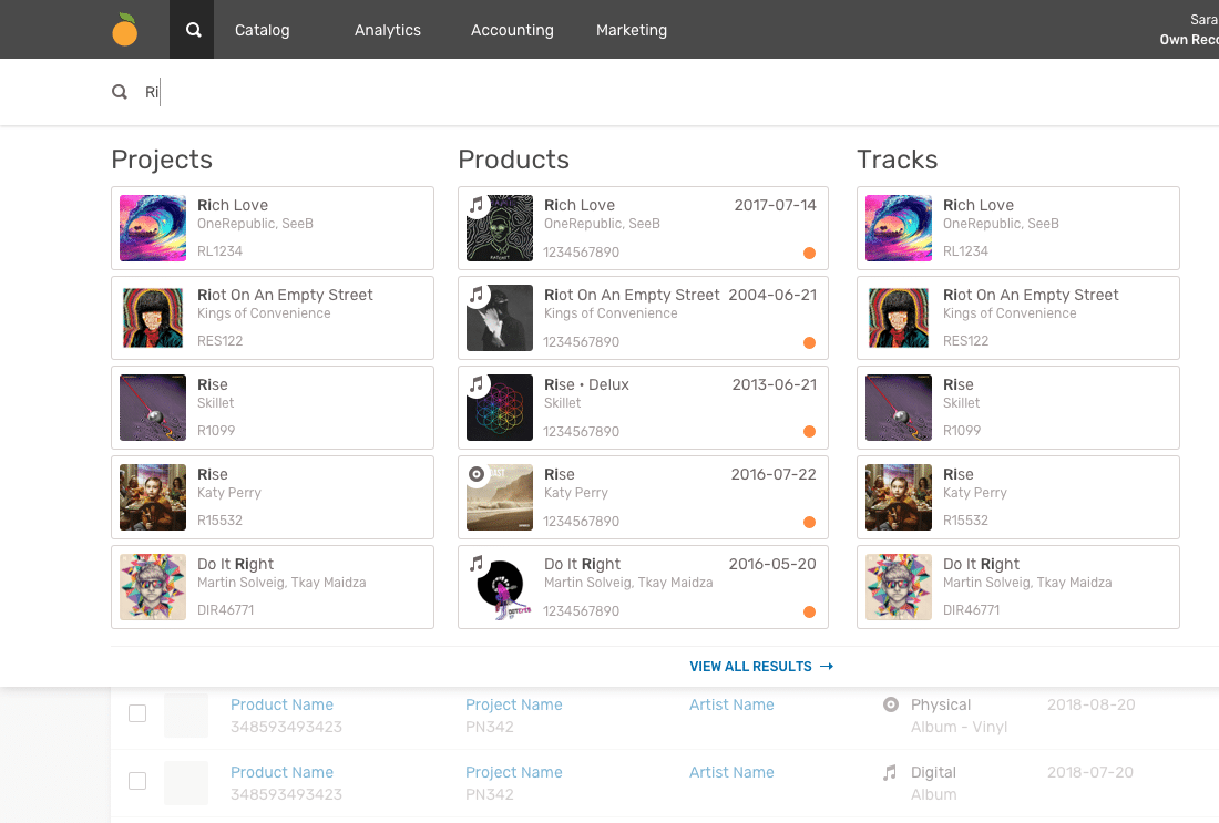
Global Search
As speed and efficiency were core tenets of the redesign, we elevated search to the global navigation, enabling users to access catalog items from whatever page they were in their workstation, while remaining in their current workflow.
Expanded Filters
We expanded filtering options to include boolean terms such as UPC and project codes. While a calendar view of releases was incorporated into our long term vision and frequently mentioned by clients, we provided a release date filter as an incremental improvement to aide clients with their scheduling workflows.

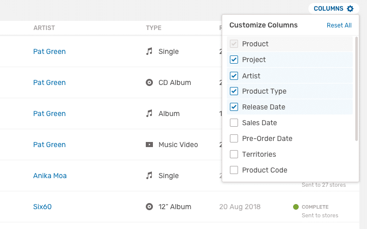
Customized Views
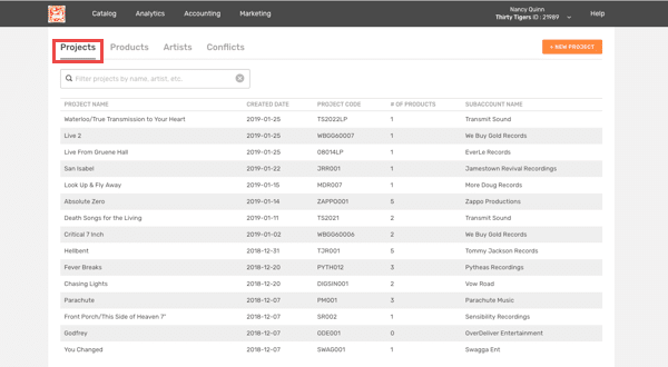
We discovered varying mental models between how artists and bigger labels needed to organize their catalogs. To provide a simplified at-a-glance overview, we reduced the number default columns, while allowing power users the ability to customize their column views to map to their internal systems and workflows.
Consistent metadata and statuses
Tidying up inconsistencies across product types and statuses allowed us to logically group similar metadata (such as UPC’s and product names) and include parent projects for all products. With engineering support, we were able to map consistent statuses across product type, ultimately removing confusion amongst users.

Additional Product Details
During our initial ideation phase, we explored providing an expanded view of product details which was eventually incorporated into our longterm vision. However, to provide incremental improvements towards this feature, we introduced the ability to access store delivery links for any digital product directly from the catalog page.

Individual Product actions
During interviews, labels had expressed much of the bulk actions to be redundant, as most actions revolved around individual releases. We deprioritized bulk actions, in favour of individual actions button, allowing users to submit, duplicate, or delete releases – actions that previously required the navigation to the parent product page to perform.

PHASE FOUR
Validating our sprint solution
To test and validate our prototype, we reached out to a mix of participants we interviewed with earlier, along with users we hadn’t yet spoken to. Since we had included a lot of new functionality in our prototype, I wrote out a list of design assumptions, accompanied by a task or question for the user test script to ensure these were covered in our final prototype:
Sprint Prototype Demo
Findings
Our proposed solution tested well with users and addressed many of their prior pain-points. Where some new functionality was missed (such as customizing columns and store links) we increased visibility of these UI controls to include labels and icons.
Following testing, we wrapped up the sprint by reviewing our findings and proposed solution with stakeholders for sign off, before iterating the designs and breaking down stories with product and engineering leads prior to development.
Establishing a Long Term Vision
While the emphasis was on delivering a feasible short term solution, it was easy to dismiss blue sky concepts that were out of scope for the initial redesign. I wanted to ensure we captured and organized more ambitious approaches to solving catalog management problems while they were in our collective focus. During and following the sprint, I worked with two members of the product design team to memorialize the key ideas that would form a north star vision, to explore and validate further.
Product Quick Views
One of the more compelling ideas to come out of the ideation phase was to provide access to expanded release metadata without having to leave the product page. While we explored a number of ways of achieving this, such as expandable rows, the approach that seemed most appealing was a side-slide card.
This would sit above the page, allowing the user to take action at the content level while still in context. Additionally, the concept scales to other content types, such as artists and tracks, and could be utilized in as a pattern in other areas of the application.

Flexible Views
Providing a singular catalog view that works for across vastly different users with varying catalog sizes, release schedules and breadth of roles is enormously challenging. While we made improvements to display a default catalog view that balances varying user needs, we also acknowledged that the perspective and order a user manages their catalog is deeply tied to their workflows.
We explored providing a toggle to allow users to pivot between views, from calendar centric to better manage release scheduling, to a Kanban view to manage tasks across teams.

Comprehensive Views
The initial catalog rebuild was focused on products (digital audio, physical audio and videos), however the long term vision must also scale to managing and connecting metadata across these entities, to create a fully connected label copy system.

Outcomes and Learnings
Following the design sprint, the catalog designs were brought into the product team’s roadmap. I worked alongside the PM and engineers to assess the feasibility of our designs, and set the scope of the rebuild project.
Being able to share a long-term vision also helped in the engineering decision to develop the new page using GraphQL, as it meant ultimately users could navigate across pages and workflows without having to query the same content – resulting in a faster and more efficient user experience.
Ultimately rebuilding the page from the ground up in this manner slowed the eventual relaunch, however leveraging the underlying technology has provided the advantage of being able to build faster tools and services across the workstation, and ultimately creating a more connected system.
Speed and workflow improvements
After the rebuild, the catalog page loaded 6 times faster, from an average of 20 seconds to an average of 3 seconds.
In addition to page load performance, providing users with more information from the catalog page has resulted in a reduction reduction in clicks required to access key metadata and information (such as storefront links.) This is was reflected in an increased page exit rate from 10% to 20%, indicating users are finding the information they’re looking for on the catalog page.
Blueprint for future design sprints
Following the design sprint, the core team of a Product Designer (me), a Product Manager and a Product insights researcher conducted a sprint retro, to debrief and discuss what aspects worked well, what didn’t and what we could improve upon next time.
What Worked
- Committing to the process helped us maintain focus and accomplish goals
- Incorporating flexibility and modifying exercises to fit our needs and constraints
- Taking time to set goals and gather background research before sprint started
What Didn’t
- Limited Stakeholder involvement or perspectives outside tech/product org
- Truncated debate and discussion following sketch session
- Lack of user journey exercises resulted in more ‘feature generation’ than solutions for end-to-end user scenarios
What To Improve Next Time
- Include more diverse range of perspectives across the organization
- Commitment through entire process (as much as possible)
- Block out time + book physical spaces!
- Give equal weight to each sprint phase
We also presented the sprint process to the wider product and design teams, sharing our thoughts and suggestions for when and how to run a sprint at The Orchard in the future. Additionally, I created generic templates from our artifacts, such as planning docs and sketch workshops, for future use.
On reflection, while our design sprint could have benefited from more lead-in time and stakeholder involvement, it enabled us to deliver to a successful solution in an expedited manner, while laying the path for more ambitious plans.